
Color
Brown Color: Meaning, Symbolism & Uses.
Represents earth or wood, brown is a natural color that provides security. It is associated with determination and reliability.
Verified & sourced, 12 mai 2026
In brief
Meaning & symbolism.
Chine
passé
Éthiopie
deuil
General
Brown, a warm color with natural undertones
Generally, we associate cool colors with blue and warm colors with red. Yet natural brown has the peculiarity of blurring the lines. For example, an oak floor diffuses an atmosphere that is both warm and soothing.
According to several scientific studies on materials, wood possesses comforting and reassuring qualities. This is why it remains a recommended choice in interior design.
Furniture and warm ambiance
In a space like a pool or kitchen, light wood furniture, especially in brown tones, stimulates appetite for healthy and natural products. Moreover, this atmosphere invites cooking and sharing.
Finally, it is impossible to imagine a mountain cabin without raw wood walls. As a result, raclette always seems more flavorful in this warm and authentic setting.
Decoration
Brown in wall paint: between tradition and contradiction
In interior decoration, brown is not always unanimous. It embodies nature in its unchangeable aspect, but also nostalgia. For example, a deep brown can convey a desire for stability, a return to roots, and loyalty to traditions.
This color rarely invites change. It sometimes gives the impression of a gaze turned toward the past, which can harm a dynamic or contemporary atmosphere.
Opposing views: Feng Shui vs. color specialists
According to Feng Shui principles, dark brown shades can generate negative vibrations. Conversely, interior color specialists readily recommend them, particularly to enhance bright shades like pink, turquoise, or apricot.
For example, a solid wood cabinet will stand out perfectly against a turquoise wall, creating a strong and elegant contrast.
Where to avoid brown in wall paint?
Brown is discouraged in certain rooms like bathrooms or kitchens. Indeed, it can create a dull, even "dirty" atmosphere.
However, in a rustic kitchen, particularly with dark wood, it is possible to use very saturated colors on walls, curtains, or countertops to energize the space.
Restaurants and visual identity: caution with brown
Many restaurant owners instinctively choose brown to highlight traditional cuisine. However, this choice can quickly seem outdated if not balanced.
As a result, it is recommended to incorporate modern furniture or design elements to update the overall image of the establishment and avoid an overly retro atmosphere.
History
The world's oldest pigments
Brown earths are humanity's first pigments. Goethite, a variety of iron oxyhydroxide, already served the paintings at Lascaux. Ochres, siennas and umbers come from the ground, grind without chemistry and do not shift: they are among the most stable pigments on the whole palette.
A macabre parenthesis
From the sixteenth to the nineteenth century, painters used a brown obtained by grinding Egyptian mummies, known as mummy brown. The practice ended less from scruple than from convenience: as early as 1829 a technical manual notes it was used far less now that bitumen gave a comparable result.
Did you know?
Color by the numbers.
100 000 ans
Ocre préhistorique
Les ocres, oxydes de fer rouges, jaunes et bruns, comptent parmi les plus anciens pigments : un atelier de préparation d'ocre vieux de 100 000 ans a été mis au jour à Blombos, en Afrique du Sud (Henshilwood et al., Science, 2011). À Lascaux, les rouges sont des hématites et les jaunes des goethites (ministère de la Culture).
Maillard
Couleur du café
La couleur brune du café torréfié vient en grande partie des mélanoïdines, pigments bruns formés par la réaction de Maillard entre sucres et acides aminés lors du chauffage (Iriondo-DeHond et al., Frontiers in Nutrition, 2021).
1998
UPS Brown déposé
Le brun des véhicules UPS est enregistré comme marque aux États-Unis depuis le 27 janvier 1998 (USPTO, enregistrement n° 2 131 693).
2019
Emballage et goût
Les travaux de Carlos Velasco et Charles Spence (Multisensory Packaging, Palgrave Macmillan, 2019) montrent que la couleur d'un emballage oriente les attentes gustatives du consommateur.
Noyer
Luxe bois naturel
Le brun du noyer, de l'acajou ou du wengé évoque l'authenticité, la durabilité et le savoir-faire en design intérieur.
Professional
Brown in the professional world: tradition and trust
In business, the brown color is particularly recommended for those who wish to highlight artisanal expertise. For example, it is perfectly suited to food shops, cobblers, or antique dealers, where authenticity is a major asset.
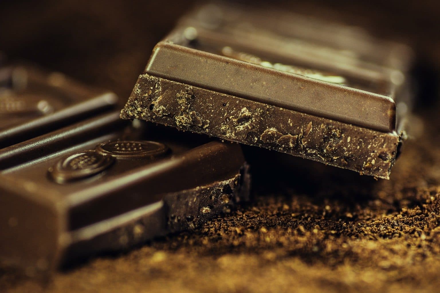
Chocolate: an iconic color for artisans of taste
Naturally, chocolate color finds its place among chocolatiers. Used as the primary hue, it underlines quality, expertise, and manual work.
In addition, when paired with vibrant shades like fuchsia pink, anise green, or turquoise, it brings a touch of modernity and freshness to the visual identity.
Fashion
Brown in clothing
Brown was long the colour of whatever was left undyed. Raw wool, linen and untreated leather come out brown, and monastic habits as well as workwear took their shade from that, with no dyer involved. It is the exact opposite of deep black or scarlet, which were expensive precisely because they required a process.
That origin explains what the colour still carries. Brown reads as sober, durable and unassuming, where black reads as a decision and red as a statement.
In practice
- Camel goes with almost everything. Navy, olive, burgundy, grey: the warm sandy shade holds with each of them, which makes it the highest-return piece in a wardrobe.
- Brown and black compete. Both are dark and neutral, so neither dominates. Pairing them requires a clear gap in value or in material, or it looks like a mistake.
- Material matters more than shade. Brown in suede, in worsted wool or in waxed leather does not give the same perceived colour three times over. That holds for every dark shade, and for brown in particular.
Anecdote
The brand that made brown its name
UPS is the textbook case of brown as a brand identity, and the only one where the colour became the company's own name in its advertising.
The choice dates from 1916. Charlie Soderstrom, then taking charge of the fleet, ruled out yellow as too conspicuous for vehicles delivering on behalf of shops, which they were not meant to upstage. He also ruled out black, common at the time but impossible to keep clean. He settled on the brown of Pullman sleeping cars, which then stood for first-class travel.
The lesson fits in one sentence: brown was chosen for its discretion, and it is that discretion, held for a century, that turned it into a brand asset.
Brand identity
Brown is the least wanted colour, and the most effective when chosen
In every preference survey, brown comes last. That is exactly what makes it a strong choice: nobody picks it by default, so picking it is always a decision.
It works in three registers. Craft and the natural, where it speaks of raw material. Leather luxury, where tobacco and cognac browns carry an idea of patina and duration that black does not have. And food, from coffee to chocolate, where it is literally the colour of the product.
Two traps
- Dreariness: a desaturated brown over a large area drifts towards dull and dated. It needs material, texture or a warm contrast to stay alive.
- Technical confusion: brown is not a hue on the colour wheel, it is a dark desaturated orange. Palette generators therefore rarely produce good ones, and they have to be built by hand.
Color theory
Chromatic harmonies.
The color wheel organizes colors by their spectral relationship. These four combinations make it possible to build coherent, perceptually balanced palettes around marron.
Terreux naturel
Caramel, noisette et chocolat créent une harmonie naturelle évoquant la forêt, le café et l'artisanat. Dominante des marques bio, alimentaires et de décoration intérieure.
Luxe cuir
Marron et or : l'association des maroquineries de luxe (Louis Vuitton, Hermès, Berluti). Le marron signifie l'authenticité et la durabilité des matières nobles.
Contraste chaud-froid
Chocolat foncé + blanc crème : contraste élégant et chaleureux. Esthétique pâtisserie fine, café de spécialité et librairies indépendantes.
Analogue automnale
Acajou, marron et ocre brun : une harmonie profonde évoquant l'automne, les épices et la chaleur. Idéale pour les univers gastronomiques et saisonniers.
Art & culture
The color in art history.
From Van Gogh's sunflowers to pop-culture submarines, marron has crossed every major artistic period with renewed energy and symbolism.
Le Repas des paysans
Louis Le Nain
Le Nain peint la vie paysanne dans une palette de bruns ocre et de gris. Ces marrons terreux ne sont pas un choix de pauvreté mais un choix esthétique : ils ancrent la scène dans la réalité de la terre et du travail des champs.
Les Mangeurs de pommes de terre
Vincent van Gogh
Van Gogh peint délibérément dans des tons de terre et de brun pour montrer que ses paysans « ont labouré la terre avec les mains dont ils mangent les pommes de terre ». Le marron y est dignité et authenticité, non misère esthétique.
Monogramme LV
Louis Vuitton
Georges Vuitton crée le monogramme LV sur fond marron toile enduite. Ce brun spécifique (PMS 4625 C) est devenu l'une des couleurs de marque les plus reconnues au monde. Le marron signifie ici le cuir, l'artisanat et l'héritage.
Nude Descending a Staircase
Marcel Duchamp
Duchamp peint son nu cubiste dans des ocres et bruns sombre. La teinte brune unifie le mouvement décomposé dans le temps, le corps se fondant dans l'espace architectural. Le marron y est continuum, non couleur de chair.
Sépia (série de dessins)
Rembrandt van Rijn
Rembrandt dessine à l'encre de seiche (sépia) brune sur papier. Ses lavis bruns créent des ombres d'une profondeur photographique. Le marron-sépia est la couleur du temps lui-même : toute ancienne photographie ou estampe tend vers ce brun mélancolique.
Packaging
Brown in packaging: tradition, quality, and sustainability
In packaging, brown is a powerful color for conveying authenticity, quality, and product respect. For example, in the food sector, it evokes a traditional recipe and artisanal expertise, perceived as healthier and more honest.
Kraft paper: the natural ally of ethical branding
Used in the packaging of gadgets or accessories, kraft paper combines minimalist aesthetics and environmental consciousness. Paired with green, it becomes a symbol of handmade craftsmanship and sustainable commitment.
Moreover, this type of packaging gives the impression that the product was designed with care, in an artisanal approach. As a result, it reflects a long-term commitment, far removed from disposable items or fleeting trends.
Science & nature
The color in nature.
Long before inks and screens, marron established itself across the plant, animal, and atmospheric kingdoms. Physics and biology explain the precise mechanisms.
Humus et oxydes de fer
La couleur brune des sols est due à deux composants : l'humus (matière organique décomposée, brun noir) et les oxydes de fer (goethite, limonite, brun-rouge). La richesse d'un sol se lit souvent à son intensité brune : plus foncé, plus fertile.
Réaction de Maillard
La couleur brune du chocolat, du pain et du café torréfié est due à la réaction de Maillard : une réaction entre sucres et acides aminés lors du chauffage, qui produit des centaines de composés aromatiques bruns (mélanoïdines).
Phéomélanine et eumélanine
Le pelage brun des cerfs, ours et chevaux est dû à un mélange d'eumélanine (noir) et de phéomélanine (jaune-rouge). Le ratio exact détermine la nuance du brun. Les grizzlis ont plus d'eumélanine que les ours bruns clairs.
Lignine et tannins
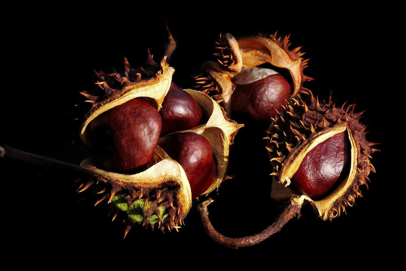
Le bois brunit sous l'effet de la photodégradation de la lignine (UV + oxygène). Les tannins (polyphénols) des chênes et châtaigniers donnent leur teinte brune au bois foncé et aux cuirs tannés végétaux. Ce brunissement naturel est irréversible sans traitement.
Polyphénol oxydase
Quand une pomme coupée brunit, c'est la polyphénol oxydase qui oxyde les tanins en quinones brunes au contact de l'oxygène. Ce mécanisme est identique au tannage cutané sous UV : l'oxydation des polyphénols mélaniques produit le brun protecteur de la peau.
Luminosity
Luminance & visual perception.
Le marron est une couleur sombre malgré son apparence chaude et terrestre. Sa luminance relative (0,05 à 0,12 selon la nuance) le place parmi les couleurs sombres, aux côtés du violet et du marine. Ce comportement photométrique en fait une excellente couleur de texte sur fond clair.
HSL luminosity vs perceived
En HSL, le marron est une teinte orange assombrie (H ≈ 20 à 35°, S 60 à 90 %, L 15 à 35 %). Sa faible luminance relative, malgré une saturation élevée, résulte de la faible valeur HSL et de la contribution limitée du canal vert à la luminosité perçue.
The Weber-Fechner law
Formulated in 1860, this law establishes that the perception of a sensation is proportional to the logarithm of the stimulus intensity. Applied to colors: we perceive brightness differences better in dark tones than in light ones, which explains why subtle variations are harder to distinguish in the lightest shades.
Luminance spectrum · shades of marron
0.078
Luminance relative
Le marron #7B3F00 a une luminance relative de 0,078 malgré sa chaleur visuelle. Cette valeur basse, proche du violet sombre, lui confère d'excellents ratios de contraste sur fond blanc : 8,2:1, niveau AAA.
~ 600 nm
Longueur d'onde
Le marron est une version assombrie de l'orange (590 à 620 nm). Il n'existe pas dans le spectre à haute luminosité : c'est une couleur contextuellement dépendante, qui n'apparaît que par contraste avec des couleurs plus claires.
8.20:1
Ratio sur blanc
Le marron foncé #7B3F00 sur fond blanc atteint 8,2:1, dépassant le seuil AAA (7:1). C'est l'une des couleurs chaudes les plus accessibles pour la typographie, souvent choisie pour les identités visuelles artisanales et gastronomiques.
Color codes
Shades & chromatic values.
Each shade of marron below has a unique spectral signature. These HEX, RGB, CMYK and HSL codes are ready to use in CSS, your design software, or when calibrating an offset print.
| Shade | HEX | RGB | CMYK | HSL |
|---|---|---|---|---|
Marron clair | #C4956A | 196, 149, 106 | 0 / 24 / 46 / 23 | 28°, 40%, 59% |
Brun foncé | #4A2C17 | 74, 44, 23 | 0 / 41 / 69 / 71 | 24°, 53%, 19% |
Chocolat | #7B3F00 | 123, 63, 0 | 0 / 49 / 100 / 52 | 31°, 100%, 24% |
Caramel | #C68642 | 198, 134, 66 | 0 / 32 / 67 / 22 | 31°, 50%, 52% |
Noisette | #8B6914 | 139, 105, 20 | 0 / 24 / 86 / 45 | 41°, 75%, 31% |
Acajou | #C04000 | 192, 64, 0 | 0 / 67 / 100 / 25 | 20°, 100%, 38% |
Ocre brun | #CC7722 | 204, 119, 34 | 0 / 42 / 83 / 20 | 33°, 72%, 47% |
Contrast
Contrast & perception.
Le contraste mesure la différence de luminance relative entre deux couleurs. La formule WCAG calcule un ratio entre 1:1 et 21:1. Le marron foncé, avec sa luminance de 0,078, offre de très bons ratios sur fond blanc et fond clair, ce qui en fait un choix typographique premium et accessible.
The ratio formula
The ratio is calculated as: (L1 + 0.05) / (L2 + 0.05), where L1 is the relative luminance of the lighter color and L2 that of the darker one. Relative luminance is computed from linearized RGB components.
// Luminance relative du marron #7B3F00
R = 0.197 · 0.2126 = 0.0419
G = 0.050 · 0.7152 = 0.0358
B = 0.000 · 0.0722 = 0.0000
L = 0.0419 + 0.0358 = 0.0777
The three WCAG thresholds
Visual examples · marron in context
Brun foncé sur blanc
Excellent pour corps de texte. Ton chaleureux et naturel pour les marques artisanales et alimentaires.
Chocolat sur blanc
Très bon contraste. Utilisé par les marques gastronomiques, chocolatiers et café de spécialité.
Caramel sur blanc
Insuffisant pour tout texte. Réserver aux éléments décoratifs et illustrations.
Accessibility
WCAG 2.1.
Summary of 5 tested combinations with marron, from worst to best contrast ratio. Use as a quick reference during the design phase.
| Combination | Preview | Ratio | WCAG | Recommended use |
|---|---|---|---|---|
Brun foncé sur blanc | Aa | 9.2:1 | AAA ✓ | Excellent pour corps de texte. Ton chaleureux et naturel pour les marques artisanales et alimentaires. |
Chocolat sur blanc | Aa | 7.4:1 | AAA ✓ | Très bon contraste. Utilisé par les marques gastronomiques, chocolatiers et café de spécialité. |
Caramel sur blanc | Aa | 2.8:1 | ÉCHEC | Insuffisant pour tout texte. Réserver aux éléments décoratifs et illustrations. |
Acajou sur blanc | Aa | 4.5:1 | AA ✓ | Contraste AA pour texte courant. Ton acajou chaud et affirmé pour les identités artisanales. |
Chocolat sur crème | Aa | 6.9:1 | AA ✓ | Association pâtisserie et gastronomie. Chaleur et authenticité pour tous les supports éditoriaux. |
Frequently asked questions
You may be wondering.
- Quelle est la signification psychologique du marron ?
- Le marron est la couleur de la terre, du bois et de l'humus. Psychologiquement, il évoque l'authenticité, la stabilité, la chaleur et le naturel. Il active des associations biophiliques ancrées dans l'évolution humaine : les environnements avec des matières bois réduisent le stress selon les études de Joye et van den Berg. Dans l'alimentation, le marron évoque le chocolat, le café et la pâtisserie artisanale.
- Comment utiliser le marron en design pour évoquer la terre et l'authenticité ?
- Associez le marron à des textures naturelles (bois, cuir, kraft) et à une typographie serif pour un positionnement artisanal crédible. Évitez les marrons trop saturés qui peuvent sembler kitsch. Le chocolat (#7B3F00) sur blanc offre 6,9:1 (AA ✓), excellent pour les interfaces éditoriales food. Combinez marron/beige/crème pour une palette warmth cohérente.
- Quels sont les codes hex des principales nuances de marron ?
- Chocolat : #7B3F00 · Brun : #964B00 · Marron acajou : #C04000 · Terre de Sienne : #A0522D · Caramel : #C68642 · Fauve : #E0833A · Sépia : #704214 · Havane : #6E3B1F. En CMYK, le brun est environ 0/50/80/40 selon la nuance.
- Quelles marques utilisent le marron comme couleur principale ?
- UPS (brun Pullman), M&Ms (marron traditionnel), Hermès (kraft), Ferrero Rocher, Nespresso (marron et or), Louis Vuitton (monogramme marron/fauve), Timberland et Levi's. Aux États-Unis, le brun des véhicules UPS est enregistré comme marque depuis 1998. Dans l'alimentation, le marron évoque systématiquement le chocolat et le café.
- Quelle est la différence entre le marron brun et le marron chocolat ?
- Le brun (#964B00, hue 30°) est un orange très sombre et désaturé, tirant vers le roux. Il évoque le bois naturel et la terre. Le chocolat (#7B3F00, hue 28°) est plus sombre encore et plus rouge, évoquant le cacao. En design, le brun est utilisé pour les marques nature et outdoor, le chocolat pour les identités gastronomie et confiserie premium.
- Comment le marron est-il produit en impression offset ?
- Le marron se forme par mélange de CMY avec une forte proportion de K. Un brun typique est environ 0/50/80/40 CMYK. L'acajou est plus rouge (0/70/90/20). Le chocolat intense peut nécessiter un Pantone spécifique (ex. PANTONE 469) pour une reproduction fidèle. Attention : le marron est l'une des couleurs les plus sujettes aux variations d'une presse à l'autre.
- Quels sont les accords chromatiques du marron ?
- Complémentaire : bleu-cyan (accord jardin et naturel). Accords classiques : marron/crème (authenticité et élégance naturelle), marron/or (luxe artisanal, référence Hermès/Louis Vuitton), marron/vert (palette forêt), marron/rose poudré (tendance lifestyle). Le marron est l'une des rares couleurs qui s'associe harmonieusement avec presque toutes les teintes chaudes.
- Pourquoi le marron est-il associé à la nature et à la rusticité ?
- Le marron est la couleur omniprésente dans les environnements naturels terrestres : sol, écorce, graines, roches sédimentaires. Cette présence massive dans l'environnement humain ancestral crée des associations profondes de sécurité, de ressources et de territoire. En design biophilique, les matières marron (bois, cuir, terre cuite) améliorent le confort ressenti dans les espaces de travail. La rusticité évoque la compétence artisanale et le savoir-faire traditionnel.
Sources
References & sources.
- Britannica, perception et psychologie de la couleur
- Michel Pastoureau, Brun, histoire d'une couleur, éditions du Seuil
- Carlos Velasco et Charles Spence, Multisensory Packaging, Palgrave Macmillan (2019)
- Études sur les matériaux naturels en architecture (biophilie) : Joye et van den Berg
- WCAG 2.1, ratios de contraste
From colour to project
Putting this colour to work.
A colour only means something inside a system: a logo, a website, a printed piece. Here is where that work happens.
Let's work together
Got a project? Let's talk.
One contact from start to finish, a reply within 24 hours. No commitment, no jargon.