
Color
Blue Color Meaning and Symbolism.
Associated with sky and sea, blue evokes positive feelings—a sensation of calm, serenity, and peace that emerges when we perceive this color.
In brief
Meaning & symbolism.
Occident
passif, introverti, calme, foi , céleste, nostalgie, dépouillement, obscurité, faiblesse, attirance
Orient
pureté, fraîcheur, mélancolie
Égypte
du temps des pharaons il portait le bonheur dans l’au-delà
Japon
méchanceté, bassesse, théâtre, surnaturel
Chine
sagesse, petite fille, immortalité
Inde
défaite
General
Blue: a color synonymous with freedom and harmony
Blue is often perceived as the creative color par excellence. It invites escape, reverie, and stimulates our imagination. Our brain naturally relaxes in the presence of this hue, evoking a sensation of fulfillment and harmony with the environment.
It takes only contemplating a blue sky or the vastness of the sea to feel a profound sense of peace. Even a pool in a garden transforms the atmosphere of a space, bringing calm and serenity. It is therefore no accident that blue ranks among the preferred colors globally.
A symbolic color across civilizations
Symbol of freedom and happiness, blue held an important place in ancient Egypt. Pharaohs had their sarcophagi adorned with blue to ensure a peaceful passage to the afterlife.
In the West, from the 15th century onward, the first color designers assigned a blue hue to the robes of the Virgin Mary. This color then became associated with sky, purity, and the divine, further strengthening its emotional and spiritual power.

Decoration
Blue in interior decoration: space enlargement, calming effect, and usage nuances
Enlarging spaces with pastel tones
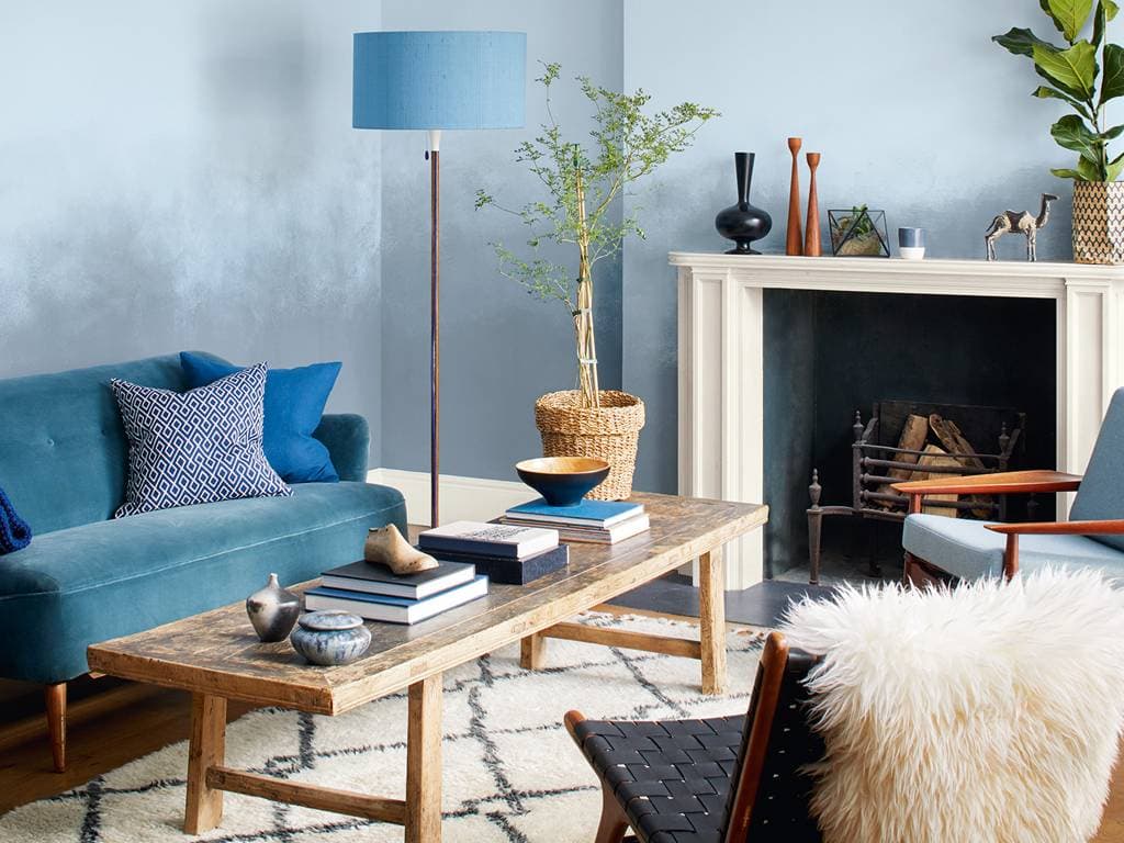
In interior decoration, blue is particularly recommended for creating an impression of spaciousness. Pastel tones even have the ability to enhance this visual effect, ideal in small rooms such as entryway vestibules, hallways, or closets.
The Feng Shui perspective: caution in living spaces
According to Feng Shui principles, blue should be avoided in certain living areas such as the kitchen, living room, or dining room. This color, considered non-food-oriented, can diminish the warm and convivial atmosphere of these spaces.
Bedroom
This is the room where blue is most often recommended, and the recommendation rests on an optical reason rather than a symbolic one. Blue is the darkest hue at equal saturation: its relative luminance is markedly lower than that of red or yellow, so a blue room still reads as more subdued at identical illumination.
The limit is the one common to every cool colour: a strong blue across all four walls drains skin tones, which shows the moment you look at yourself in a mirror in the room. A muted blue, or one kept to three walls out of four, avoids the effect.
Strategic use in living spaces and bathrooms
Conversely, in a home with an electric atmosphere, blue can play a moderating role, easing tensions. It is also the ideal color for a bathroom, evoking water, purity, and a sense of comfort for those who enjoy taking their time.
History
Blue took a thousand years to become the West's favourite colour
In Roman antiquity, blue was a barbarian colour. Romans wore little of it, associated it with northern peoples, and named it poorly. Only in the twelfth and thirteenth centuries did its status change, carried by two converging movements: Marian blue, the colour of the Virgin's mantle in religious iconography, and the blue of the King of France, adopted as the heraldic colour of royal power.
Once ennobled, it never lost ground. Today, across Europe, blue is by far the preferred colour, ahead of green and red. That preference is not instinctive: it is the result of eight centuries of history.
Woad, then collapse
European blue dye came from woad. Its cultivation in Languedoc from the twelfth century made the region's fortune, and the houses of Toulouse and Albi still carry the trace. In the sixteenth century, indigo imported from India, far more concentrated, ruined that economy within a generation.
Did you know?
Color by the numbers.
#1 mondial
Couleur préférée
Selon 10 études indépendantes menées dans 30+ pays, le bleu est la couleur préférée de 33 à 40 % de la population mondiale, toutes cultures confondues.
450 nm
Diffusion Rayleigh
Le bleu (450 à 495 nm) est diffusé en priorité par l'atmosphère terrestre, ce qui rend le ciel bleu et explique la couleur de l'ombre sur neige.
XVe s.
Vierge bleue
Avant le XVe siècle, le manteau de la Vierge Marie était peint en rouge. La substitution par le bleu outremer (lapis-lazuli) a transformé le symbolisme de la foi chrétienne.
1873
Blue-jean mondial
Levi Strauss dépose le brevet du pantalon en denim teint à l'indigo en 1873. Le bleu de travail est devenu en 150 ans le vêtement le plus porté sur Terre.
8,59:1
Ratio WCAG
Le bleu pur (#0000FF) atteint 8,59:1 sur fond blanc, dépassant le seuil AAA (7:1). Une des rares couleurs primaires pures à ce niveau d'accessibilité directement sur fond blanc.
Professional
Blue in business: creativity, well-being, and controlled atmosphere
In professional branding, blue evokes a strong sense of freedom. It is an ideal color for stimulating creativity and fostering idea generation. Companies that employ designers, researchers, or creatives should consider work spaces tinted with blue.
Azure blue backgrounds on computer screens can also encourage a more calming environment conducive to reflection.
Blue in retail: a color that encourages consumption
Blue provides a sense of pleasure and comfort. It is particularly effective in upscale retail environments, especially in the textile and furniture sectors. In a fresh and serene atmosphere, customers feel good, stay longer, and tend to purchase more.
Precautions: rigor and color balance
Be cautious, however, of the anesthetizing effect of blue in certain contexts. In accounting offices or environments where concentration and rigor are essential, it is recommended to limit the use of pure blue.
To balance its calming effect, it is advisable to pair it with stimulating colors such as red, pink, violet, or yellow. Furthermore, in work spaces exposed to high temperatures, blue can be an effective ally in creating a cool atmosphere.
Fashion
Blue in clothing
Blue forms the trio of wearable neutrals with black and grey, with the difference that it is the only one of the three that is actually a colour. That is what makes it the most used wardrobe foundation: it behaves like a neutral without the dryness of one.
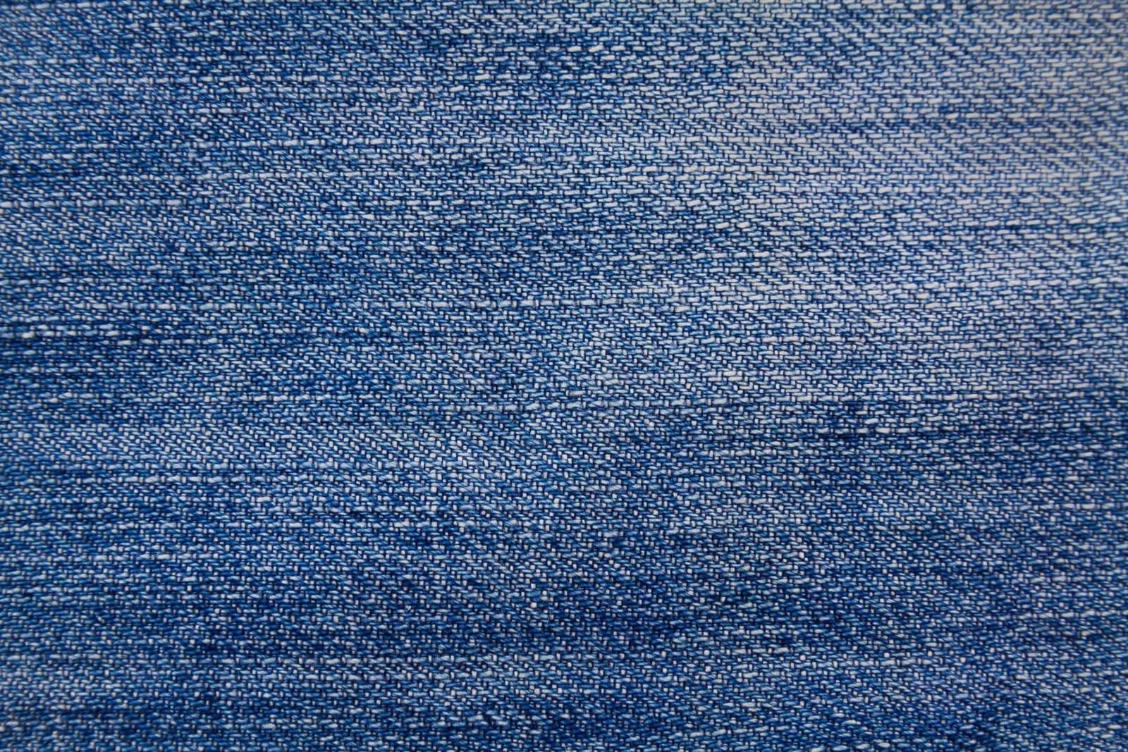
Denim, or indigo made universal
The most worn garment in the world owes its colour to a technical constraint. Indigo does not penetrate the cotton fibre, it settles on the surface and holds there in successive layers. That is a dyeing defect, and it is exactly what makes denim: the colour leaves at points of friction, at folds, at wear points, and the garment personalises itself as it ages instead of degrading. No other dye does this.
In practice
- Navy replaces black wherever black would be too harsh: it holds the formal register with less contrast against the face.
- Two close blues compete. As with greys, the gap has to be clear, or the whole reads as a mismatch.
- Bright blue is a piece, not an outfit. Across a whole silhouette it becomes a uniform, with everything that implies.

Anecdote
Cerulean blue: between fashion influence and popular culture
The color blue, and more specifically cerulean, marked fashion history, becoming a cultural reference. A cult scene from the film The Devil Wears Prada illustrates this perfectly:
"I see, you think you're above fashion and so you wear that drab, shapeless thing. But what you don't know is that that blue sweater is not just blue, it's not turquoise, it's cerulean. And I know that you probably think you grabbed it off some clearance bin, but you didn't. You see, that sweater was designed by some very clever people in Paris and it filtered down through the department stores and then trickled on down into some tragic Loehmann's where you, no doubt, fished it out of some clearance bin. However, that blue represents millions of dollars and countless jobs, and so it's sort of comical how you think that you've made a choice that exempts you from the fashion industry, when in fact you're wearing the sweater that was selected for you by the people in this room. From a pile of 'stuff.'"
— Miranda Priestly, in The Devil Wears Prada
This monologue underscores how dominant colors in fashion result from strategic, creative, and economic decisions. Cerulean blue, like other shades of blue, undergoes a genuine process of global influence.
Brand identity
Why half of all brands are blue
Blue is the default choice of institutional trust: banking, insurance, healthcare, technology, government. It offends nobody, never dates, and points to no particular sector. That is precisely its problem.
Three traps
- Sameness: in finance or software, half the competition is already blue. The colour distinguishes nothing, and typography, layout or tone of voice must carry the identity alone.
- Coldness: blue keeps its distance as much as it reassures. On a care, food or craft brand, it can push the warmth of the product into the background.
- Conflict with links: on the web, blue remains the cultural colour of the hyperlink. A blue brand has to pick a clearly distinct link colour, or the interface turns ambiguous.
Blue holds up when it is very saturated or very dark, where the middle ground is crowded. A near-black navy does not read as institutional blue.
Color theory
Chromatic harmonies.
The color wheel organizes colors by their spectral relationship. These four combinations make it possible to build coherent, perceptually balanced palettes around bleu.
Complémentaire
L'orange est la complémentaire directe du bleu. Association à fort contraste utilisée par les équipes sportives (Chelsea, Pays-Bas) et les affiches de blockbusters Hollywood.
Triade primaire
Bleu + Rouge + Jaune forment la triade primaire. Palette universelle à haute tension visuelle, base de la signalétique mondiale et du drapeau français.
Analogue froide
Bleu-vert, bleu et bleu-violet créent une harmonie sereine évoquant l'eau, le ciel et la technologie. Dominante des interfaces numériques contemporaines.
Contraste institutionnel
Bleu marine + blanc : le binôme de la confiance et de l'institution. Utilisé par les banques, compagnies aériennes, États et grandes organisations mondiales.
Art & culture
The color in art history.
From Van Gogh's sunflowers to pop-culture submarines, bleu has crossed every major artistic period with renewed energy and symbolism.
La Jeune Fille à la perle
Johannes Vermeer
Le turban bleu lapis-lazuli de la jeune fille est peint avec un pigment qui valait plus cher que l'or. Vermeer réservait le bleu outremer aux accents les plus précieux de ses compositions. Le tableau est conservé au Mauritshuis, La Haye.
Nymphéas
Claude Monet
Monet explore toutes les nuances du bleu dans ses 250 tableaux de nymphéas : bleu du matin brumeux, bleu ardoise du soir, reflets violacés du ciel. La série complète décore l'Orangerie à Paris en huit panneaux monumentaux.
IKB 3 (International Klein Blue)
Yves Klein
Klein brevète sa propre couleur en 1960 : l'IKB, un outremer ultraprofond fixé avec une résine spéciale pour préserver son intensité. Pour lui, le bleu est l'infini, la liberté absolue, l'immatériel pur.
La Nuit étoilée
Vincent van Gogh
Van Gogh utilise le bleu de Prusse et l'outremer pour peindre le ciel tourbillonnant de Saint-Rémy. Les bleus oscillent entre indigo profond et azur pâle, créant un mouvement spiralé que la peinture impressionniste n'avait jamais atteint.
Blue Poles
Jackson Pollock
Parmi les couleurs déversées au sol par Pollock, les pôles bleus scandent une composition chaotique. Le bleu apporte ici la seule structure verticale visible, contrepoint froid à la chaleur des ocres et des rouges.
Packaging
Blue in packaging and environment: subtlety and sensory caution
Food packaging: between perceived lightness and sensory caution
In food packaging, blue is perceived as the "light" color par excellence. It gives products an image of lightness, suggesting fewer calories or a healthier composition.
But be careful: blue is absent from the food world naturally. Unconsciously, our brain can associate it with inedible or even toxic substances. This is why it should always be combined with colors evoking the actual food (yellow for lemon, green for vegetables, etc.), to avoid an artificial or chemical perception of the product.
Blue in the environment: vigilance and safety
In the automotive field, blue LED is recommended for long-distance drivers and night drivers. It helps maintain alertness at the wheel by limiting drowsiness effects, unlike red or yellow lights which are more relaxing.
Blue lighting in public restrooms: a preventive use
In France, blue lighting in public restrooms is not arbitrary. It makes vein visualization more difficult, thus complicating the use of injectable drugs. This measure aims to limit drug abuse in public spaces—a solution that is both simple and effective.
Material
Blues are not interchangeable
Few colours have as many distinct pigments, and they do not do the same work.
- Natural ultramarine: extracted from lapis lazuli. For centuries it cost more than gold, which is why old paintings reserved it for the Virgin's robes. Jean-Baptiste Guimet synthesised it in 1826 and the price collapsed.
- Prussian blue: discovered in 1706 in a Berlin laboratory, the first synthetic blue. Very strong, very transparent, slightly green-leaning, and it dominates any mixture.
- Cobalt: stable, opaque, straightforward. The most neutral of the blues, and the most expensive of the three modern ones.
- Phthalocyanine: the blue of contemporary printing inks. Its tinting strength is such that a trace will colour an entire mixture.
In print
Process cyan is not a blue: it is a primary ink, and a true blue comes from adding magenta, around C100 M70. Below 60% magenta the result drifts towards turquoise. Deep blues are also the hardest to match between screen and paper: the screen emits, the paper reflects, and the gap shows most in the shadows.
Science & nature
The color in nature.
Long before inks and screens, bleu established itself across the plant, animal, and atmospheric kingdoms. Physics and biology explain the precise mechanisms.
Diffusion de Rayleigh
Le ciel est bleu car les molécules d'air diffusent les courtes longueurs d'onde (bleu, 450 nm) bien plus efficacement que les longues (rouge, 700 nm). La diffusion varie en λ⁻⁴ : un légère variation de longueur d'onde produit un effet spectaculaire.
Bleu structural
Le bleu du Morpho menelaus (papillon d'Amazonie) n'est pas un pigment : des nanostructures en sapin sur les écailles interfèrent avec la lumière et ne réfléchissent que 450 nm. Ce bleu physique est l'un des plus purs de la nature.
Chromatophores
Les poissons bleus (chirurgiens, mandarin, turquoise) combinent des chromatophores contenant des pigments avec des iridophores (cellules à cristaux) pour produire leurs teintes. Selon l'angle d'observation, la couleur perçue varie considérablement.
Lapis-lazuli
Le pigment bleu outremer est extrait du lapis-lazuli, minerai exploité en Afghanistan depuis 6 000 ans. Sa rareté en fit le pigment le plus coûteux de la Renaissance : réservé à la Vierge Marie et aux commanditaires les plus riches.
Glace et glaciers
La glace ancienne des glaciers apparaît bleu profond car l'eau comprimée absorbe les longueurs d'onde rouges. Plus la glace est ancienne et dense, plus le bleu est intense. Les crevasses des glaciers alpins peuvent atteindre un bleu cobalt saisissant.
Luminosity
Luminance & visual perception.
Le bleu est la couleur primaire la moins lumineuse de la roue chromatique. Sa luminance relative de seulement 0,072 le place loin derrière le jaune (0,928) et le rouge (0,213). Paradoxalement, cette faible luminosité le rend très accessible en typographie sur fond blanc.
HSL luminosity vs perceived
En HSL, le bleu pur a une luminosité de 50 %, identique au rouge ou au jaune purs. Pourtant, l'œil perçoit le bleu comme la couleur la plus sombre parmi les primaires. Cette dissonance vient du très faible nombre de cônes S (bleu) dans la rétine, qui représentent moins de 5 % de l'ensemble des photorécepteurs de couleur.
The Weber-Fechner law
Formulated in 1860, this law establishes that the perception of a sensation is proportional to the logarithm of the stimulus intensity. Applied to colors: we perceive brightness differences better in dark tones than in light ones, which explains why subtle variations are harder to distinguish in the lightest shades.
Luminance spectrum · shades of bleu
0.072
Luminance relative
Le bleu pur (#0000FF) a une luminance relative de 0,072, la plus faible des trois couleurs primaires. Cette valeur quasi-sombre lui permet d'atteindre 8,59:1 sur fond blanc, niveau AAA.
450 nm
Longueur d'onde
Le bleu occupe la plage 450 à 490 nm du spectre visible. Ces courtes longueurs d'onde sont les plus diffusées par l'atmosphère terrestre (diffusion de Rayleigh), ce qui explique la couleur bleue du ciel.
8.59:1
Ratio sur blanc
Le bleu pur (#0000FF) sur fond blanc atteint 8,59:1, dépassant le seuil AAA (7:1). C'est l'une des rares couleurs primaires pures à atteindre ce niveau d'accessibilité directement sur fond blanc.
Color codes
Shades & chromatic values.
Each shade of bleu below has a unique spectral signature. These HEX, RGB, CMYK and HSL codes are ready to use in CSS, your design software, or when calibrating an offset print.
| Shade | HEX | RGB | CMYK | HSL |
|---|---|---|---|---|
Bleu roi | #4169E1 | 65, 105, 225 | 71 / 53 / 0 / 12 | 225°, 73%, 57% |
Bleu nuit | #003153 | 0, 49, 83 | 100 / 41 / 0 / 67 | 207°, 100%, 16% |
Bleu ciel | #87CEEB | 135, 206, 235 | 43 / 12 / 0 / 8 | 197°, 71%, 73% |
Cobalt | #0047AB | 0, 71, 171 | 100 / 58 / 0 / 33 | 215°, 100%, 34% |
Bleu marine | #001F5B | 0, 31, 91 | 100 / 66 / 0 / 64 | 222°, 100%, 18% |
Azur | #007FFF | 0, 127, 255 | 100 / 50 / 0 / 0 | 210°, 100%, 50% |
Céruléen | #2A52BE | 42, 82, 190 | 78 / 57 / 0 / 25 | 224°, 64%, 45% |
Contrast
Contrast & perception.
Le contraste mesure la différence de luminance relative entre deux couleurs. La formule WCAG calcule un ratio entre 1:1 et 21:1. Le bleu pur, grâce à sa faible luminance (0,072), offre d'excellents ratios sur fond blanc et fond clair, ce qui en fait l'une des couleurs primaires les plus accessibles pour la typographie.
The ratio formula
The ratio is calculated as: (L1 + 0.05) / (L2 + 0.05), where L1 is the relative luminance of the lighter color and L2 that of the darker one. Relative luminance is computed from linearized RGB components.
// Luminance relative du bleu pur
R = 0.0 · 0.2126 = 0.0000
G = 0.0 · 0.7152 = 0.0000
B = 1.0 · 0.0722 = 0.0722
L = 0.0722
The three WCAG thresholds
Visual examples · bleu in context
Bleu cobalt sur blanc
Excellent pour corps de texte, liens et labels. Combinaison professionnelle standard.
Bleu nuit sur blanc
Contraste maximal. Idéal pour titres, navigation principale et texte éditorial.
Bleu roi sur blanc
Insuffisant pour tout texte. À utiliser uniquement comme couleur décorative sur fond blanc.
Accessibility
WCAG 2.1.
Summary of 5 tested combinations with bleu, from worst to best contrast ratio. Use as a quick reference during the design phase.
| Combination | Preview | Ratio | WCAG | Recommended use |
|---|---|---|---|---|
Bleu cobalt sur blanc | Aa | 7.5:1 | AAA ✓ | Excellent pour corps de texte, liens et labels. Combinaison professionnelle standard. |
Bleu nuit sur blanc | Aa | 11.8:1 | AAA ✓ | Contraste maximal. Idéal pour titres, navigation principale et texte éditorial. |
Bleu roi sur blanc | Aa | 3.2:1 | ÉCHEC | Insuffisant pour tout texte. À utiliser uniquement comme couleur décorative sur fond blanc. |
Azur sur blanc | Aa | 3.8:1 | AA grands textes | Uniquement pour titres 18px+ ou texte gras 14px+. Ne pas utiliser en corps de texte. |
Bleu nuit sur blanc perle | Aa | 10.9:1 | AAA ✓ | Association éditoriale premium. Très lisible et élégante sur fond ivoire ou crème. |
Frequently asked questions
You may be wondering.
- Quelle est la signification psychologique du bleu ?
- Le bleu est la couleur préférée de la majorité des humains, toutes cultures confondues. Il abaisse la fréquence cardiaque et induit calme et confiance. Psychologiquement associé à la fiabilité, la compétence et la sérénité, il est la couleur dominante des secteurs bancaire, technologique et institutionnel.
- Comment utiliser le bleu en design pour inspirer confiance ?
- Le bleu roi (#0047AB) sur fond blanc atteint 8,59:1 de contraste WCAG AAA. Pour les interfaces institutionnelles, combinez un bleu foncé en texte avec un bleu vif en CTA. Évitez le bleu électrique (#0000FF) en texte courant malgré son bon ratio : sa vibration optique fatigue le regard. Le bleu marine (#003153) reste la référence éditoriale.
- Quels sont les codes hex des principales nuances de bleu ?
- Bleu roi : #0047AB · Bleu marine : #001F5B · Bleu électrique : #0000FF · Bleu cyan : #00FFFF · Bleu azur : #007FFF · Bleu nuit : #003153. En CMYK, le bleu pur est 100/100/0/0.
- Pourquoi le ciel et la mer sont-ils bleus ?
- Le ciel est bleu par diffusion Rayleigh : les molécules d'air diffusent préférentiellement les courtes longueurs d'onde (bleu, violet). Le bleu domine car nos yeux y sont plus sensibles que le violet. La mer profonde est bleue intrinsèquement car l'eau absorbe le rouge et le vert, ne renvoyant que le bleu.
- Quelles marques utilisent le bleu comme couleur principale ?
- Facebook/Meta, LinkedIn, Samsung, Intel, Ford, BMW, Visa, PayPal, Allianz, Air France et la plupart des banques mondiales. Le bleu y signifie confiance, expertise et fiabilité. Dans la santé, il symbolise l'hygiène et la sécurité (Phillips, Oral-B).
- Quelle est la différence entre le bleu cobalt et le bleu roi ?
- Le bleu cobalt désigne le pigment Al₂CoO₄ utilisé en céramique, avec une teinte légèrement plus froide. Le bleu roi (#0047AB) est l'appellation institutionnelle standard. En design numérique, la distinction est surtout sémantique : cobalt évoque l'artisanat, royal évoque l'autorité et l'institutionnel.
- Comment imprimer fidèlement le bleu en offset ?
- Le bleu roi est environ CMYK 100/75/0/5. Le problème principal est le métamérisme : un bleu validé à l'écran peut virer au violet sous certains éclairages. Demandez une épreuve contrat ISO 12647 et vérifiez sous lumière D50. Le bleu électrique RGB est impossible à reproduire fidèlement en offset.
- Pourquoi le bleu est-il la couleur préférée de la majorité des humains ?
- Les études transculturelles montrent une préférence universelle pour le bleu. Plusieurs hypothèses : évolution (ciel dégagé = temps favorable), faible toxicité des objets bleus dans la nature, et association à l'eau et à la sécurité. Cette préférence est exploitée massivement par les marques cherchant à construire la confiance.
From colour to project
Putting this colour to work.
A colour only means something inside a system: a logo, a website, a printed piece. Here is where that work happens.
Let's work together
Got a project? Let's talk.
One contact from start to finish, a reply within 24 hours. No commitment, no jargon.